Space Study 002 • Lori Weitzner Design • New York, NY
New York native, Lori Weitzner, thrives on the energy of the city that she calls home to create interior oases for her clients. Her aesthetic is inspired by global travels, and age-old design practices. An infusion of traditional craftsmanship, from Thailand to Japan, is interpreted with a modernity and taste level that makes her products a trusted choice for spaces like Barneys, Four Seasons, Tiffany’s, Saks Fifth Avenue, and Calvin Klein.
Weitzner's harmonious juxtaposition of old and new design methods, allows for the team to boldly explore innovation, and constantly update the line with new technology in the textile industry. One such collaboration is that with Visual Magnetics on the Magnetism collection, which seamlessly pairs Weitzner’s high-end textiles with the magnetic technology that Visual Magnetics in known for. From the spaces she creates, to the one in which she’s inspired to create, we’ll learn more about how Lori Weitzner’s “white box sanctuary” lends itself to her creative process.
1. How do your design studio and office spaces differ?
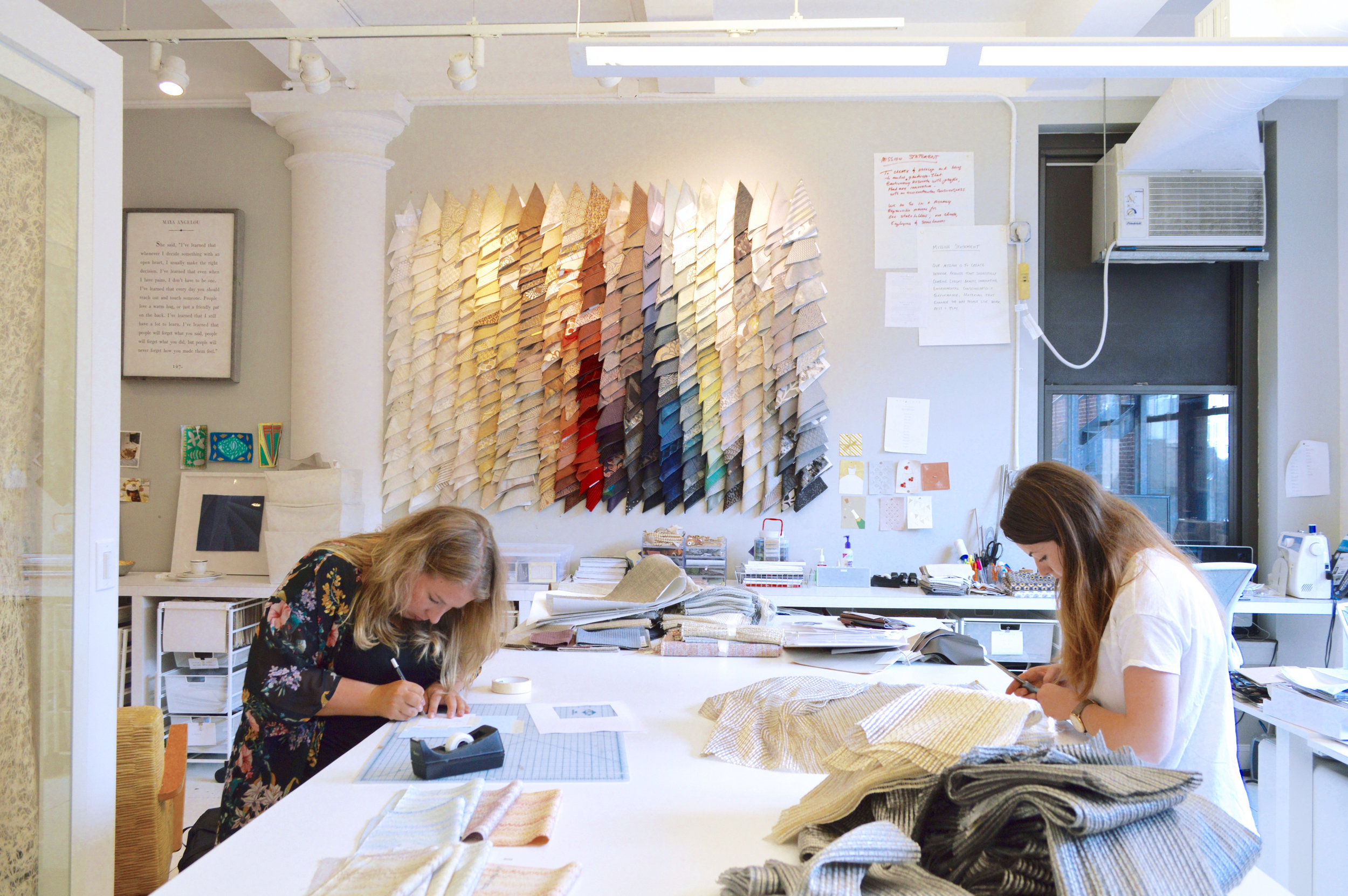
This acts as my office studio and design studio – my partners at Pollack Weitzner work from a more traditional-feeling, office downtown, and we have a warehouse in Jersey City – but here is where I work and “live”. There’s just such a creative vibe and energy – I have my private office, but all day we’re up and about, walking, talking and sharing ideas.
The intention here was to create a space that felt good the moment you walk in. Like an oasis from the urban, gritty city streets. I’m a city girl, and native New Yorker, but the irony is I’ve created this “white box sanctuary” as my creative space. The space truly reflects our creative point of view, which is ethereal, calming and nuanced … which is the opposite of much of the fast-paced, chaotic city we live in. I love creating a polarity between the outside world and my designs – its like the crazy energy of the city is what inspires us to create a space, and products, that are on the other end of the spectrum.
It’s a humble space, but there’s something about the vibe and energy, that immediately put people at ease.
2. Your office feels very serene, can you describe an office space that was less-than-desirable?
I like consistency in the furniture and the décor, so that it all connects, otherwise it's disruptive and distracting. I’ve seen office spaces where the colors are just so heavy that I don’t know how you can get energy to work. I don’t have a problem with color in space, but it has to be one that’s energizing, because you’re there to work and think.
I also think that there has to be a place – doesn’t matter size – where one can escape for a moment, and pause in their day. It can be tiny, but it has to be something.
3. What role do you think textiles play in your environment?
I’ve talked about it in other aspects of the space that we need (lighting, furniture, and accessories), but I relate it to the human body. We need all of our organs to put the space together, but for me the textile is the soul of the space – it’s the part that brings the emotional connection, and enlivens and engages the senses like nothing else can do. A beautiful cork credenza can excite, but engaging our senses? That’s what textile does to the space.
4. Which other features of your space do you find most helpful in your creative process?
I have to say that the Magnetism collection is key in giving us flexibility in the office – we have a huge wall of it, and it allows us to be able to change on a dime. It’s the same thinking that we brought into getting furniture, and a bulletin board on wheels – ability to change is so important.
We’re constantly moving the presentation board around the office, so that we can judge product in different lighting. Instead of having to move the product around, we can wheel around studio. It’s all about ease of transformation, to be able to move things around and change it up really quick.
5. What type of environment do you like to work in?
This is obviously what I like best, because it’s what I created for my own. If I had a bigger space, I’d have more fine art around – sculpture, ceramics, all of it. I’d have a gallery space. I’d want to surround my office with art that I like.
6. Any standout “don’ts” in your opinion when creating a space?
Really heavy color for an office space, and bad lighting.
7. What are some of the principles you keep in mind for designing for such a wide variety of spaces?
First priority is be innovative, and do something that hasn’t been done before, while on the other hand you have to create something that is salable. The balance can be a challenge, but it’s a good one to have. We focus on interesting materials to work with – sometimes materials drive design, sometimes design drives the materials, and sometimes it's a circle. Either way, it’s definitely a relationship.
We also have internal tenants – the “Twelve Words of Weitzner” – at the forefront of our design process. For any product that we put in the line, 8 of the 12 words must relate – its not always easy, but it keeps us consistent. Aside from wanting to create fabulous products, we need to stay on brand. People have an expectation of what our product looks and feels like, and staying true to this important. We sat down, and created the list of words as a team. We’re always changing, so we revisit to make sure that they stay current, and reflect where we are. Our last update was about a year ago – they’re tweaks, not overhauls.
The current list includes: Luxurious, Current, Ethereal, Timeless, Sensory, Inventive, Mindful, Worldly, Curated, Artisanal, Soulful, Livable
Another thing that’s up there is color – how we work with color, and how we decide which colors are part of our products. When I say sometimes materials drive design, sometimes color drives it all. I have a book coming out in December – Ode to Color: The Ten Essential Palettes for Living and Design – published by Harper Collins. I’m extremely excited – it’s a life-long dream of mine to do a book. It feels like my third child!
There are a lot of books on the market about color, but this is different. I take you through ten essential palettes, or “ten worlds of color”, as I like to call them. I immerse you in each of these worlds for 26 pages – you’ll discover lots of things: historical aspects, cultural anecdotes, design tips, fashion, etc. The worlds are dear to me – I explore palettes like Night Shadows and Waterside, and then weave in a personal essay. The goal is that this reaches beyond the design community, because it’s soulful and practical at the same time.
Contributor: Amber Davis
Marketing Coordinator at Visual Magnetics


